

Retail Shop Painting Tips: How to Attract More Customers with Colour Psychology
Walking past two shops – one with faded, dirty white walls and another with vibrant, inviting colours – which one would you enter?
In retail, first impressions matter within 7 seconds. Your shop's wall colours directly impact whether customers walk in, browse longer, and make purchases. This guide reveals how retail shop owners in Singapore can use colour psychology and professional painting to boost foot traffic and sales.
The Science: How Colour Affects Customer Behaviour
Colour psychology research shows that:
- 85% of consumers cite colour as the primary reason for purchasing a product
- 93% of shoppers make buying decisions based on visual appearance
- Colour increases brand recognition by up to 80%
- Proper lighting and colour can increase sales by 10-30%
Your shop's walls aren't just background – they're silent salespeople influencing every customer who walks past.
Best Paint Colours for Retail Shops by Industry
Food & Beverage (Cafes, Restaurants, Bakeries)
| Colour | Psychological Effect | Best For |
|---|---|---|
| Red | Stimulates appetite, creates urgency, increases energy | Fast food, bakeries (red accents) |
| Orange | Encourages impulse buying, feels friendly and warm | Casual dining, juice bars |
| Yellow | Grabs attention, feels happy and optimistic | Bakeries, dessert shops |
| Warm neutrals (beige, cream) | Feels natural, comfortable, approachable | Fine dining, cafes |
Avoid: Blue and purple (suppress appetite), pure white (feels clinical)
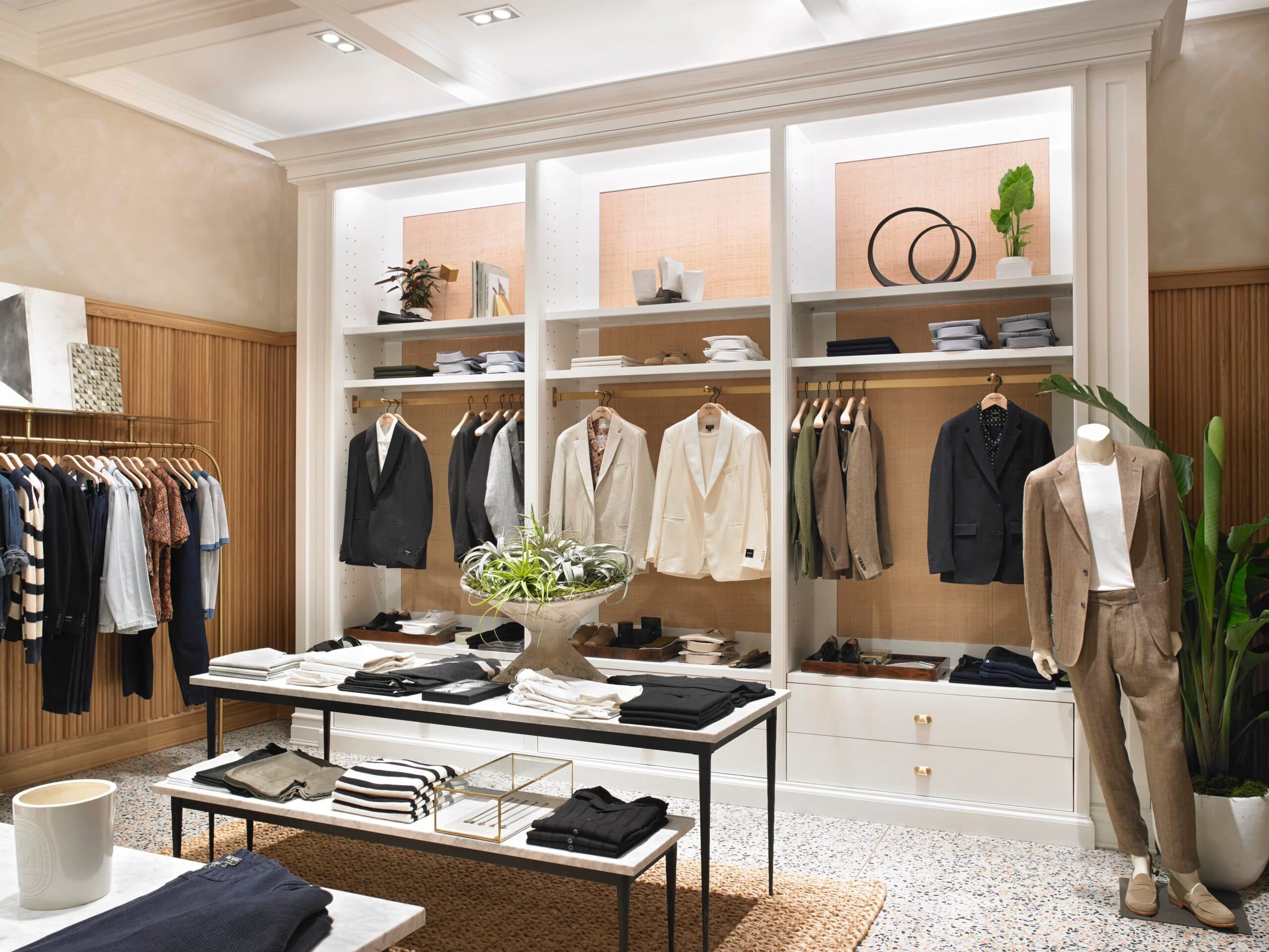
Fashion & Apparel (Boutiques, Clothing Stores)
| Colour | Psychological Effect | Best For |
|---|---|---|
| White / off-white | Clean, luxurious, premium feel | High-end fashion, bridal, luxury brands |
| Black | Sophisticated, powerful, exclusive | Premium menswear, luxury accessories |
| Soft pink / blush | Feminine, gentle, welcoming | Women's fashion, lingerie, accessories |
| Navy blue | Trustworthy, professional, calming | Corporate wear, premium casual |
Pro tip: Use neutral walls (white, cream, light grey) to make clothing colours stand out.
Beauty & Wellness (Salons, Spas, Clinics)
| Colour | Psychological Effect | Best For |
|---|---|---|
| Soft green | Calming, healing, natural | Spas, wellness centres, dermatology clinics |
| Lavender / light purple | Relaxing, luxurious, creative | Beauty salons, massage studios |
| Warm beige / taupe | Earthy, grounding, natural | Organic beauty, eco-friendly brands |
| Soft pink | Nurturing, gentle, caring | Nail salons, children's beauty |
Avoid: Bright red, orange, neon colours (creates anxiety, not relaxation)
Electronics & Gadgets
| Colour | Psychological Effect | Best For |
|---|---|---|
| Dark grey / charcoal | Modern, high-tech, sophisticated | Premium electronics, gaming stores |
| Blue | Trustworthy, reliable, intelligent | Computer shops, phone retailers |
| White | Clean, modern, minimalist | Apple-style aesthetic, gadget accessories |
Home & Furniture (Showrooms, Home Decor)
| Colour | Psychological Effect | Best For |
|---|---|---|
| Warm white / cream | Spacious, bright, welcoming | Furniture showrooms |
| Light grey | Modern, versatile, sophisticated | Contemporary home decor |
| Soft beige / taupe | Warm, comfortable, homely | Traditional furniture, home accessories |
Colour Strategies by Shop Goal
To Increase Foot Traffic (Attract Window Shoppers)
Use bright, warm colours that pop from the street:
- Red – creates urgency ("I must see what's inside")
- Yellow – grabs attention from far away
- Orange – feels friendly and approachable
Best for: Retail shops on busy streets, mall kiosks, stores relying on walk-ins
To Increase Average Transaction Value
Use premium, sophisticated colours:
- Black + white – creates luxury perception
- Navy + gold accents – feels exclusive
- Deep grey – signals quality
Best for: High-end boutiques, jewellery stores, premium brands
To Increase Browsing Time (Stay Longer)
Use calming, comfortable colours:
- Blue – relaxing, encourages exploration
- Green – restful, reduces eye strain
- Warm neutrals – feels like home
Best for: Bookstores, home decor, gift shops, museums
For Impulse Purchase Zones (Checkout Areas)
Use energetic, stimulating colours:
- Red and yellow – creates excitement, urgency
- Orange – encourages quick decisions
Pro tip: Paint the wall behind your cash wrap in an accent colour to draw attention to last-minute purchase items.
Colour Mistakes That Hurt Retail Sales
❌ All-White Walls
While white seems safe, all-white shops can feel:
- Cold and clinical (like a hospital)
- Unfinished or cheap (if lighting is poor)
- Boring and forgettable
Fix: Add one colourful accent wall or use warm off-whites instead of pure white.
❌ Too Many Bright Colours
Rainbow-coloured walls overwhelm customers and:
- Cause visual fatigue (customers leave faster)
- Clash with products
- Look unprofessional
Fix: Use the 60-30-10 rule – 60% dominant colour, 30% secondary, 10% accent.
❌ Trendy Colours That Dated Quickly
That neon pink or deep purple that's trendy today will look outdated in 2 years, requiring expensive repainting.
Fix: Use trendy colours as accents only (one wall, display areas). Keep main walls in timeless neutrals.
❌ Ignoring Your Brand Colours
If your brand logo and packaging use specific colours, your shop walls should complement (not clash with) them.
Professional Painting Tips for Retail Shops
Consider Shop Lighting
Colours look different under different lighting:
| Lighting Type | Effect on Paint Colours |
|---|---|
| Warm LED (2700-3000K) | Makes warm colours richer, cool colours appear duller |
| Cool white (4000-5000K) | Makes all colours appear brighter and sharper |
| Natural daylight | Most accurate colour representation |
Pro tip: Test paint samples under your actual shop lighting before committing.
Use Zones and Wayfinding
Use colour to guide customers through your shop:
- Entrance zone – bright welcoming colour
- Main browsing area – calming neutral
- Sale/discount zone – red or orange (creates urgency)
- Premium product zone – dark sophisticated colour
- Checkout area – accent colour to draw attention
Durability Matters in Retail
Retail shops face heavy traffic, constant touching, and regular cleaning. Choose:
- Satin or eggshell finish – easier to clean than flat/matte
- Semi-gloss for high-touch areas (door frames, columns)
- Scrubbable, stain-resistant paint – essential for retail
Plan for Minimal Disruption
For operating retail shops, schedule painting:
- Overnight (after closing, before opening)
- During slow days (Monday-Wednesday)
- Use low-odour paints – no chemical smells affecting customers next day
- Phase painting – paint section by section while shop remains open
Real Retail Colour Success Stories
Case Study 1: Bakery Increased Sales by 25%
Before: Plain white walls, felt institutional and cold
After: Warm yellow accent wall + terracotta details
Result: Customers described shop as "warm and inviting" – sales increased 25% in 3 months
Case Study 2: Fashion Boutique Doubled Premium Sales
Before: Bright pink walls (distracted from clothing)
After: Charcoal grey + white trim (clothing popped)
Result: Premium item sales doubled – customers perceived higher quality
Case Study 3: Electronics Store Reduced Bounce Rate
Before: Harsh white walls (customers felt overwhelmed)
After: Deep blue feature wall + grey elsewhere
Result: Average browsing time increased from 4 to 9 minutes
Retail Painting Costs in Singapore
| Shop Size | Basic Package | Premium Package (with colour consultation) |
|---|---|---|
| Small (200-400 sqft) | $800 - $1,200 | $1,200 - $2,000 |
| Medium (400-800 sqft) | $1,200 - $2,000 | $1,800 - $3,000 |
| Large (800-1,500 sqft) | $2,000 - $3,500 | $3,000 - $5,000 |
| Showroom (1,500+ sqft) | $3,500 - $6,000 | $5,000 - $8,000+ |
Additional services:
- Colour psychology consultation – $200 - $500
- Sample painting for testing – $100 - $300
- Overnight / weekend work – add 20-30%
Quick Colour Checklist Before Painting
Before finalising colours, consider:
- Does this colour attract my target customers?
- Does it complement my products/branding?
- Will it look good under my shop lighting